

RentalEase is a solo design project focused on creating a furniture rental app that prioritizes clarity and a clean design
Over the course of three months, I explored how furniture rentals operate in India and identified user frustrations with existing apps in the market.
The furniture rental market in India is growing fast, thanks to urbanization, changing lifestyles, and the rise of the sharing economy. Young professionals and students moving across cities prefer renting over buying, valuing flexibility, affordability, and convenience. This trend opens up a big opportunity to create better digital experiences for users who expect smooth, modern rental services.


Services have emerged to meet the growing demand for flexible furniture access, offering extensive catalogs and coverage in major metropolitan cities. However, users have reported frustrations with their rental experiences.
Research conducted online highlights several pain points related to the Know Your Customer (KYC) process, billing procedures, navigation, and other key features of the app. While these services fulfill the essential need for flexible furniture options, they fail to provide a smooth user experience, largely due to poor design. They lack consistency and transparency in their design, clear communication, easy navigation, and a simple, clean user interface.
Constantly on the move for job opportunities, they need quick, affordable furniture solutions that fit their fast-paced lifestyles.
Living in shared or rented housing, they look for budget-friendly, temporary furnishings.
Whether on project assignments or internships, they value a hassle-free rental process that let’s them get furniture with flexibility and no long-term commitment.
An app with


Keeping the visual noise to a minimum helps give the app a light and focused feel, which is not overwhelming for the user. Also, a clean, modern, well-designed app will help build trust with the users.
Understanding the business aspect of furniture rental services reveals a few steps that cannot be eliminated just because they cause frustration with the users, especially the KYC process. Hence, Communicating why certain steps are required becomes necessary.
Handling pricing with transparency and breakdowns. This again, reassures the user and builds trust by ensuring users know what they are paying for without any surprises.
Helping users navigate the app easily, by prioritizing the core functions and keep things where the user expects to find them.
This is the initial information architecture I started with. However, as I designed the app and learned more about the services currently work, the final result was somewhat different from what I initially had.


Primary
grey-200
Brand-light
brand-50
Elevation
grey-white
Positive
green-100
Highlight
grey-300
Warning
yellow-100
Disabled
grey-600
Negative
red-100
Positive-light
green-50
Brand
brand-400
Warning-light
yellow-50
Overlay-dark
grey-900, 60%
Overlay-light
grey-200, 60%
Primary
grey-900
Secondary
grey-700
Inverse
grey-white
Disabled
grey-600
Positive
green-100
Warning
yellow-100
Negative
red-100
Brand
brand-600
Default
grey-500
Brand
brand-400
Light
grey-400
Highlight
grey-700
Primary
foreground-primary
Positive
green-100
Secondary
foreground-secondary
Warning
yellow-100
Inverse
foreground-inverse
Brand
foreground-brand
Gradient-button
Gradient-icons
Gradient-radial
Gradient-slider

Display
Weight:
Semi-bold
Size:
32px
Letter spacing:
-2%
Heading 1
Weight:
Semi-bold
Size:
26px
Letter spacing:
-2%
Heading 2
Weight:
Semi-bold
Size:
22px
Letter spacing:
-2%
Heading 3
Weight:
Semi-bold
Size:
20px
Letter spacing:
-2%
Button
Weight:
Semi-bold
Size:
14px
Letter spacing:
2%
Title 1
Weight:
Medium
Size:
18px
Title 2
Weight:
Medium
Size:
16px
Title 3
Weight:
Medium
Size:
14px
Body 1
Weight:
Regular
Size:
16px
Caption
Weight:
Regular
Size:
12px


The idea was to design a logo that conveyed a sense of friendliness and feels reliable, modern, and minimal. After several sketches exploring creative ways to represent RentalEase, I settled on a single, continuous line that forms a subtle "R." The mark resembles a bow or ribbon, which gives a feeling of trust and reliability. Additionally, the logo looks clean and memorable.

“R” - representing RentalEase

Variant used in backgrounds

Variant representing “Trust score”


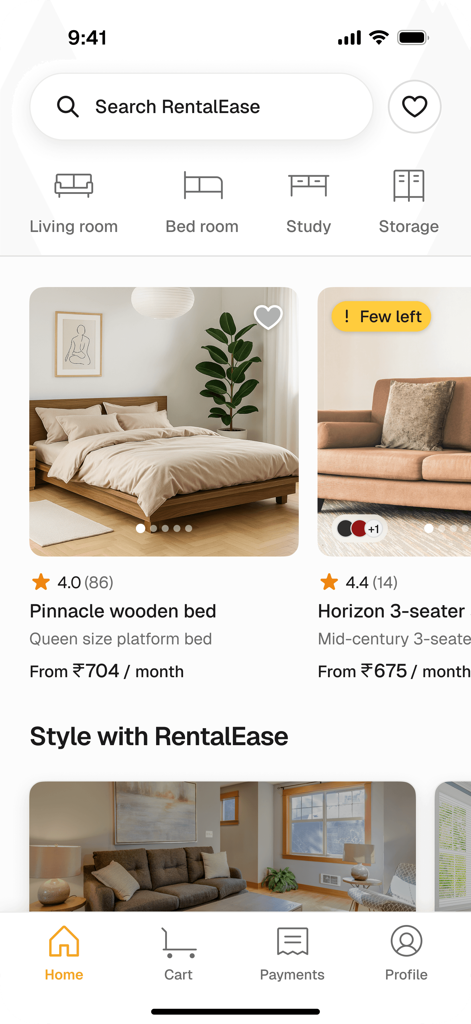


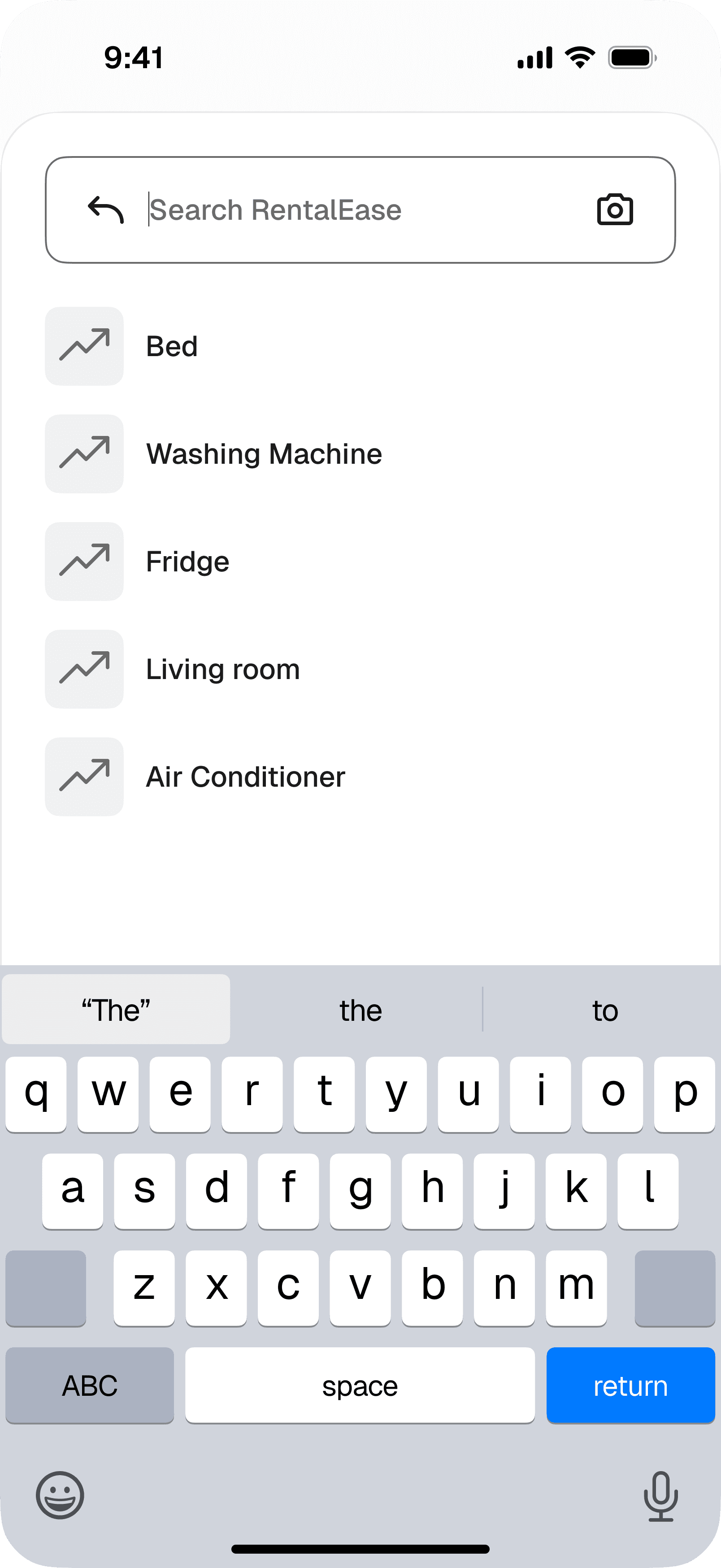


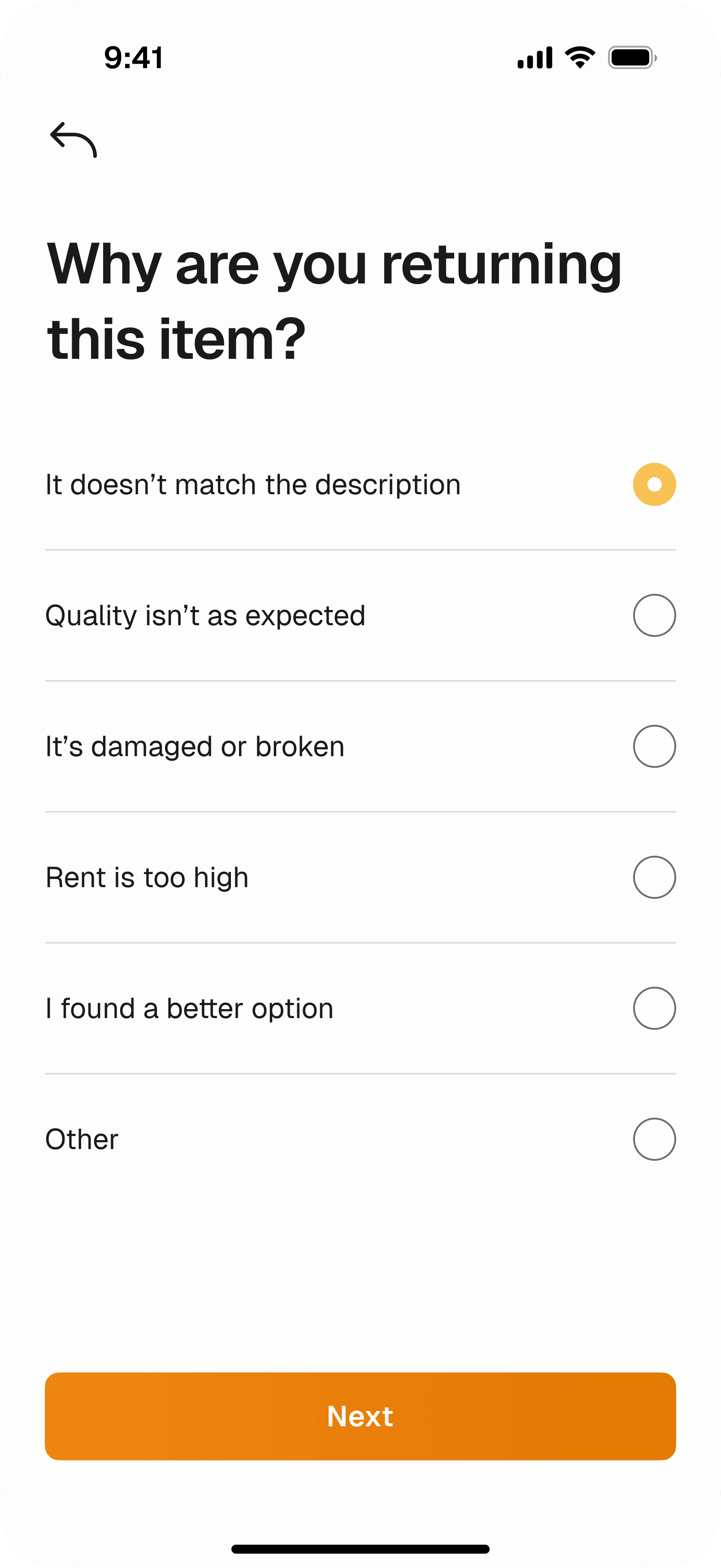


The original problem statement I started with was: "Urban professionals and students who frequently relocate for jobs or studies face challenges when it comes to renting furniture for temporary stays." My first approach was "What would a platform that enables users to rent furniture for temporary periods be like?". However, after I discovered existing platforms like Rentomojo and Furlenco, I shifted my focus toward understanding how these services operate and identifying the sources of user frustration. Hence, my solution evolved into enhancing these existing services. However, RentalEase is not simply a redesign; it serves as a foundation for a design and user-focused furniture rental app.
For me working on this project was as tiring as it was exciting, after discovering that there are services that already exist I started thinking more realistic than imaginative and started to find solutions by only implying better UX practices like being transparent and upfront with pricing and cost breakdowns, keeping user privacy by communicating and making aware on how and why their data is collected and used, rather than creating an imaginative solution that may end up being too unrealistic for the business.